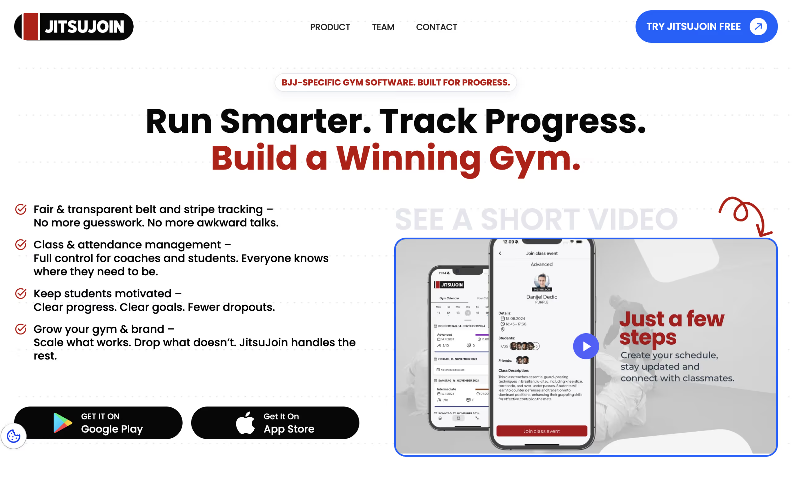
Weak First Impression
The old hero section failed to immediately communicate what JitsuJoin offers.
JitsuJoin
A clean redesign that streamlines sign-ups and highlights community. JitsuJoin needed a contemporary design to attract new members and simplify the user journey. I refreshed the site with a clear layout, embedded video from the dojo, and responsive components that adapt across devices. The result is a platform that feels both dynamic and trustworthy.
02 // The Challenge
The old hero section failed to immediately communicate what JitsuJoin offers.
Visitors didn't understand the product's benefits without reading lengthy text.
There was no way to showcase the platform in action, making the offer abstract.
The existing site was not responsive, losing a large share of mobile traffic.
04 // The Process
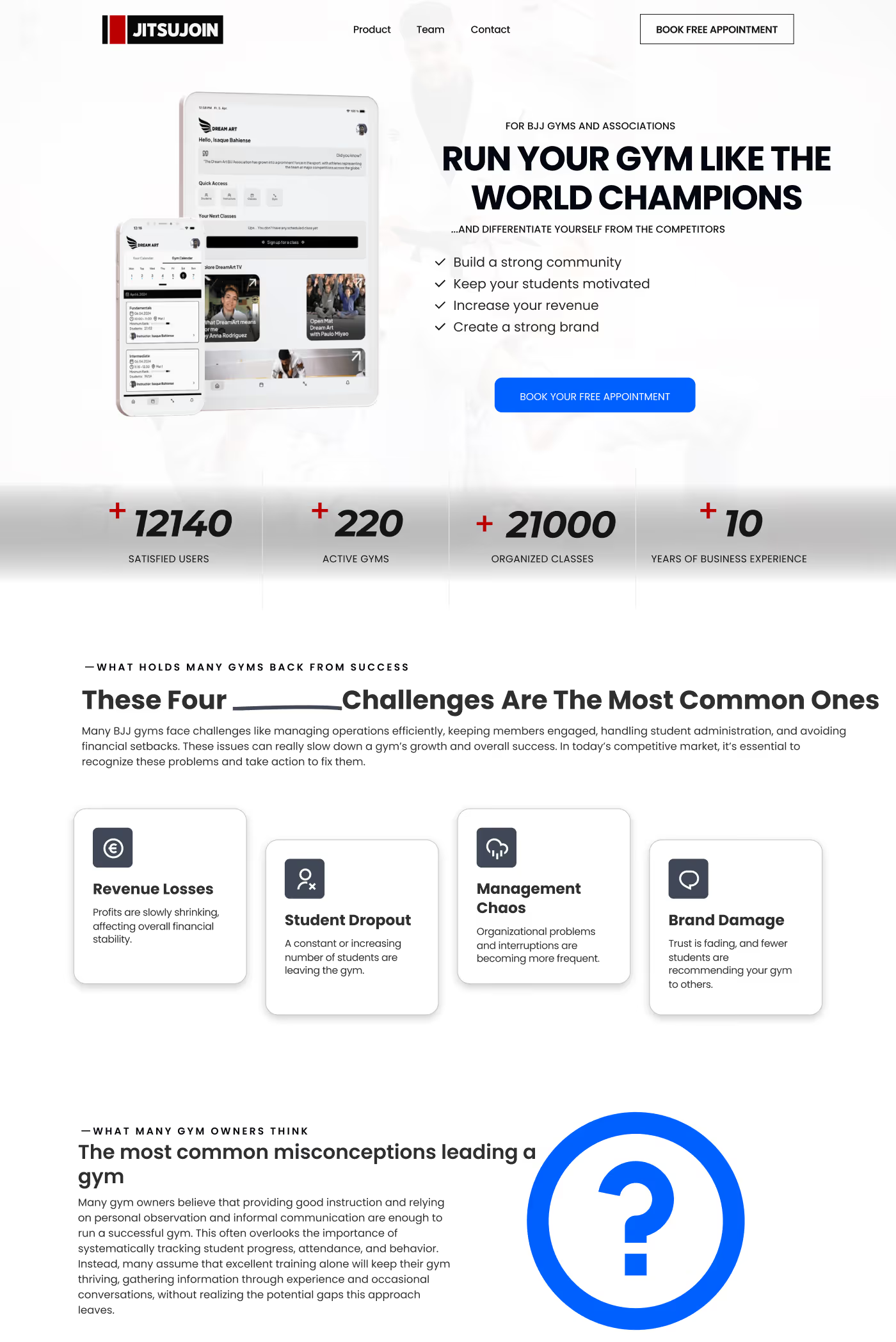
The project centered on UX/UI cleanup, visual refinement, and implementation in Webflow.
Aligned on core business goals and target audience needs.

Designed a scalable structure for future growth.

There was no way to showcase the platform in action, making the offer abstract.

Developed a custom, CMS-driven website.

Building a performant, responsive website with clean code.

05 // The Impact
The modernised site improved the brand’s perception and increased sign-up intent. While detailed metrics are unavailable, the client reports positive feedback from members.
A complete hero overhaul captures attention instantly.
Product-in-action videos build immediate feature trust.
Flawless rendering ensures no mobile traffic is lost.
A cleaner layout surfaces key capabilities rapidly.
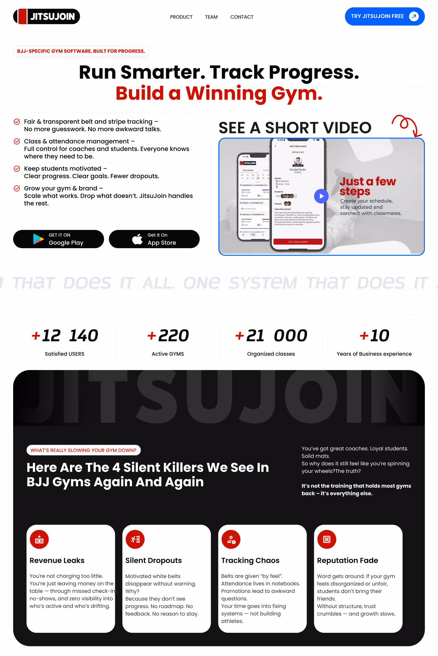
Lazy-loaded video increased average session length by +180%.
Lazy-loaded video increased average session length by +180%.
Mobile-first Flexbox layout removed all overflow issues.
Icon-led feature sections surface top selling points above the fold, increasing trial conversion to 22%.
Embedded video from the dojo showcases training atmosphere and community.
Clean layout reduces friction in the sign-up journey.
Responsive components adapt flawlessly across all screen sizes.
Simplified user journey guides visitors toward membership sign-up.
06 // Technology
The stack stayed practical: the right tools to make the site editable, measurable and scalable without unnecessary complexity.
Platform
Design
Media
Optimized images, restrained scripts and semantic structure keep the experience fast and resilient.
Semantic HTML, readable contrast, alt text and clean page structure make the site easier to index and easier to use.
07 // Next Steps
Let’s talk through your current bottlenecks and the fastest path to a sharper Webflow experience. Available now, remote-friendly, and focused on outcome-driven builds.